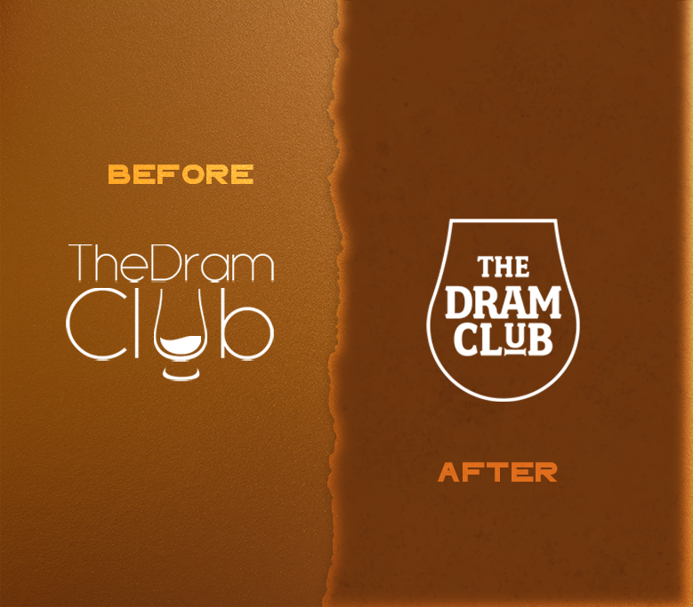
The Dram Club is a community of Whisky and Spirits enthusiasts who love exploring new drinks. We were recently tasked with refreshing their brand identity. With a shape inspired by the classic Whisky snifter, we built a shield that would best represent the community.
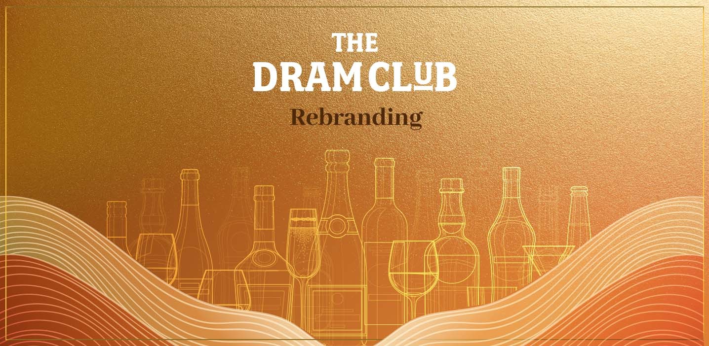
The founders of the Dram Club kickstarted their journey of creating this platform as a hobby but soon it became their primary pursuit and catapulted into a bigger social network, suite of events and product offerings. The rebranding was the core for the new endeavours and we at Black Cab knew exactly what to do!
We first began with the basics. The colours were contrasting to each other, the typeface was too small making the logo less impactful and the shape of the glass was very hard to be understood by the audience. The Glencairn glass was elemental to The Dram Club and is an iconic shape, unmissable by any spirits enthusiast. Hence we decided to maintain it at the heart of this rebranding.
We retained the Glencairn glass in the logo while working around it to fix the basics. We merged the glass with the concept of a shield with an ambition to represent a sense of community and belonging. We introduced a modern and impactful font to make the logo stand out on digital and print. This also created room for beautiful merchandising, as the font was bold enough to be printed on articles like - glasses, shirts and gift boxes.